
The Road to AdSense (8): Mobile-First Design, Because Google and Your Readers Hold Phones

In the previous part of the series we set your site's speed targets; now we move to the truth most approval-seekers overlook: the reviewer deciding your fate opens your site from a phone most of the time, and your actual visitors arrive from phones at rates exceeding three-quarters of traffic in Arabic content, and Google itself has officially indexed the mobile version for years. Mobile-first design is not a technical fashion but the default state of today's web — anyone building for desktop then patching mobile later is building backwards and paying for it in approval and ranking together.
In this part I build a complete mobile experience with you, on the standards of an AdSense-ready site, with check steps whose results you see immediately. I wrote this part after watching too many approval-ready sites lose their chance on a phone screen, so treat it as the mobile gate your site passes before any submission.
What you will do in this part:
- Understand why Google and AdSense approval measure the mobile version specifically
- Build an article page that reads on a mid-range phone without a single friction point
- Set navigation, fonts and spacing for the small screen
- Test your site as a real visitor on mobile data, not office Wi-Fi
Mobile-First Is Not a Personal Opinion
Google announced mobile-first indexing years ago — the crawler reading your site acts as a phone browser, and whatever appears on desktop but not on mobile is officially invisible to indexing. Practically, your site IS the mobile version in Google's eyes, with desktop as a secondary extra, so every design decision starts from the small screen and expands to the large, never the reverse. Desktop-first designers add decoration then squeeze it into phones with pain; mobile-first designers build a clean core then expand it at no cost.
Your visitors say the same thing in numbers: open your audience report in your analytics tool and you will find phones leading by a wide margin in Arabic content especially, because quick reading during commutes and waiting moments happens from the pocket, not the desk. A visitor struggling with your site on a small screen leaves no comment explaining why — they leave silently and never return, and those silent messages accumulate in bounce rate and session time before reaching Google's reports. Mobile is not a segment of your audience; it is your audience, in most cases.
The Small Screen Magnifies Every Design Weakness
Desktop is forgiving — bad layout hides there — while the small screen is a magnifying lens over every shortcut you took: long titles breaking illogically, stretched paragraphs filling the screen with a gray wall of no margins, buttons touching so the visitor taps the wrong one, images wider than the screen losing half their content. Open any page of your site on a mid-range phone and read it as a first-time visitor — you will discover within two minutes a list of fixes that never appeared on your desktop monitor.
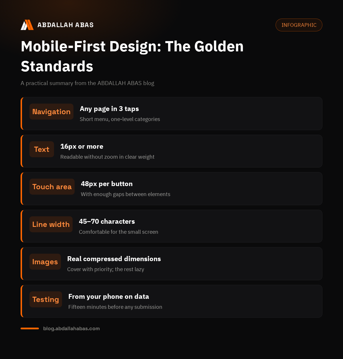
The practical standard I follow on every site I prepare: every interactive element's touch area at least forty-eight pixels with enough gap from its neighbor, body text at least sixteen pixels in readable weight, content width never stretching to screen edges but keeping breathing margins. These numbers are not aesthetic preference but the distilled result of usability guidelines — the same ones the reviewer's eyes meet when trying to read your article in its natural position.
Navigation: The Hardest Problem on Mobile
The biggest mobile challenge is the main menu — the bar carrying six links beside the logo on desktop fits two items at most on a phone. The common solution is a burger menu holding all links, but shape alone is not enough; the menu's content matters: few clear links with self-explanatory names, the most important action page at the top or in a fixed bar, no deep hierarchy needing three expansions to reach a section. Test your menu by handing your phone to someone who never saw your site and asking them to reach a specific page — watch their path with your eyes, not your mouth.
On my blog and client blogs I keep an even simpler rule: three strongest links in basic navigation, categories in one dropdown, and the important action button always visible without opening anything. The golden rule of mobile navigation: any page reachable within three taps at most — every extra tap is funnel leakage that appears later in visitor behavior reports. We built the full structure whose branches the mobile menu carries in part six of the series.
Fonts and Spacing: Reading Speed on the Small Screen
Reading on a phone needs more breathing room than desktop — white space is not aesthetic luxury but a reading tool. Use one clear Arabic font in limited weights, give line-height room for diacritics and extended letters, separate paragraphs with clearly visible spacing, because touching paragraphs become one block the reader abandons wholesale. The comfortable reading line on mobile runs forty-five to seventy characters — beyond that, the eye stutters at every line bend.
Article titles need special mobile discipline: the long title looking elegant on desktop becomes three broken lines on a phone, consuming the screen before the visitor reaches content. Keep titles structurally short where possible, and check every article on a small screen before publishing — one minute protecting the first impression of hundreds of visitors in the article's first week. If you mix two languages in one text, verify Latin words' direction inside the Arabic line: this error shows on mobile more than desktop.
| Element | Mobile standard | Common mistake |
|---|---|---|
| Body text size | 16px or more | 12px text forcing zoom |
| Touch area | 48px+ per button | Crowded links tapped wrongly |
| Line width | 45–70 characters | Full-width lines exhausting the eye |
| Content margins | Breathing margin from edges | Content glued to screen edges |
| Navigation | Three taps to any page | Deep hierarchies needing serial expansions |
Article Images on Mobile: From Size to Placement
The cover image is what the visitor sees first on their screen — give it aspect ratios suited to phones, not wide windows; compress it to open fast on mobile data; and write alt text explaining it to the crawler and screen readers. Images inside the article follow different logic than desktop: a wide image displays full-width on the phone and needs clarity surviving the small size, so choose images with a clear focal point over decorated scenes whose details vanish. A busy screenshot showing small details needs zooming on the phone — if the screenshot explains your article, make the highlighted part obvious inside the image itself, not left to zooming.
Ads, when activated later, follow the dimensions logic too: an ad unit crowding content on a small screen doubles its annoyance compared to desktop, and pre-reserved spaces protect the page from the jumps we explained in the Core Web Vitals article. Link two decisions in your mind from today: every element you add to your site has a mobile appearance you must check yourself — what you do not check, your visitors will check instead of you, and leave.
Embedded Elements on the Small Screen
Embedding a video, map, or interactive element on mobile needs more than correct display: an embed taking large space above the fold pushes the visitor to scroll before reading anything. Start embeds below the paragraph they serve, not at the top of the page; give them full content width with reserved height that never jumps; and confirm they work by touch, not mouse — some hover-built elements do not function on touch screens at all.
Testing every embed on a real device before publishing is a habit you cannot skip — the most dangerous errors appear only in the real environment: a video not displaying at correct width, a map pushing the rest of the page aside, or a heavy network embed slowing the whole page behind it. Screenshot every problem you meet now into one notes file, and fix them in one batch after reviewing all pages — this collection saves you scattered fix loops chasing every publish day.
Long-Form Reading on Mobile: Eye Comfort Over Time
A visitor reading a two-thousand-word article on their phone spends the same visual point for long minutes if the page is not comfortable — over-strong contrast, thin fonts, and long paragraphs without breath tire the eye faster than any ad. Choose a medium-weight dark font without pure black, balance contrast so text reads in sun and shade alike, and space paragraphs so the page breathes every few lines. These small details decide between a visitor completing your article and a visitor abandoning halfway, forgetting your site entirely.
Think of mobile reading as a long journey, not a short meeting, and add rest stations along the way: clear subheadings cutting the text, quotes and tables breaking monotony, and numbered lists answering fast for the skimming visitor. These stations give the eye anchor points and give the hasty reader a chance to catch value even without reading every line — the same stations helping the crawler understand your article's structure and index it better. Formatting here serves reading, not decorates it.
Forms and Buttons: The Commitment Moment on Small Screens
Every form on your site — contact or newsletter — is a commitment moment where a visitor types on a small screen with one thumb, so simplify it to the minimum: few fields, clear labels, and large unambiguous buttons. Text fields need enough size that the keyboard never hides what the visitor types, the right keyboard opens automatically for email or phone by field type, and the submit button appears clearly when the form completes, not hidden below the screen.
Test every form by sending a real request from your phone — the fastest way to discover problems invisible in the form's code: an error message flashing away too fast, a submit button covered by the keyboard, or a success with no clear message. The visitor struggling with your form rarely retries — their phone journey toward your site ends in seconds, which makes a mobile-healthy form the cheapest site improvement with the highest effect on real requests.
Mobile Speed Is Not Desktop Speed
I covered speed metrics in the previous part; here stands the essential difference: home Wi-Fi is relatively stable, while mobile data swings between excellent signal and congestion pressure within the same day, and the phone itself processes scripts slower than an ordinary desktop. So desktop test results do not represent the mobile visitor — correct measurement happens in a real mobile environment or with a slow-network simulation in developer tools.
The practical rule of mobile experience: assume your visitor on an average network with a mid-range phone, and optimize for that scenario, not the best case. A page opening in two seconds on your desk may take five on a visitor's phone in city-center congestion — the difference between those numbers is the stay-or-leave decision. I detailed the three metrics and their targets in part seven of the series; here keep one rule: open your site from your phone on mobile data today, log every waiting second you feel — that list is your first priorities.
A Real Mobile Check: Fifteen Minutes Before Submitting
Reserve a quarter hour with a real phone on mobile data and open your site as a new visitor: does the homepage tell you the site's topic within seconds? Can you open the menu and reach any category in two taps? Does the article read without zooming and without horizontal scrolling? Do buttons respond to one finger on first attempt? Do images and videos appear at correct dimensions? Does the page jump while loading? Write every note in one sheet ordered by pages — that sheet is your complete mobile fix plan.
This human check does not replace tools but completes them: tools measure technical numbers, while your eyes on a real screen measure the exact experience the reviewer and your visitors will pass through. Make this check a fixed habit before every important publish and every official submission, and run its list on your site's most important pages, not every page — eighty percent of mobile problems repeat in the template itself and show once per page.
This Week's Application Steps
Close this part with a concrete execution plan, not textual memorization: open your site on your phone today and log the full check notes; then fix the main menu first — the highest impact; then adjust the template's fonts, text sizes and content margins; then review cover images and their mobile dimensions; then check every embed in your three most important articles. Re-measure after this fix batch in a mobile environment, and you will find the difference measurable in open time and reading comfort together.
With this your site has taken a fundamental step on its approval path — a site reading smoothly from a phone keeps its visitors, shows Google healthy experience data, and presents itself seriously to the review team. The series' next part continues the path: what exactly happens after you press the submit button in AdSense, and how your request travels inside review until the decision issues — follow it standing on these ready foundations.
Questions From Those Building Mobile Experience
Do I test only on my own phone or other devices too?
Your phone discovers nine of every ten problems, but add one wide-screen phone and one small one if available from family or friends — different sizes reveal different breaking and crowding behaviors. What matters in testing is real mobile data, not Wi-Fi: the network is half the mobile experience. Browser emulators are a quick step during work, not a substitute for real testing before publishing.
Do I need an app to publish content on mobile?
No — a well-designed website delivers the same service in the browser with no download and no storage, and custom publishing apps add a technical and maintenance burden your current stage does not justify. Focus your energy on the site opening fast and reading smoothly in any phone's browser: that is the real requirement of your audience and Google together. Apps come later if a real audience asks for them, never before.
Do dropdown menus harm mobile experience?
One dropdown containing clear categories is useful and organized; deep sequences of menus inside menus are what kill mobile experience, needing serial taps and high touch precision. Keep one navigation level under the menu button, and let your real test discover whether one level suffices. The rule: the visitor reaches their goal in the fewest taps possible — any complexity distancing that goal is the enemy, not the shape used.
Can I check mobile from my computer if I lack a phone?
Developer tools offer a phone-screen mode catching breaking and crowding errors well, but it gives neither the slow network nor touch precision nor the real size feeling — a partial simulation useful during work. For any official review before submission, find a real phone, even borrowed for days: the difference between emulator and reality equals the difference between reading a dish's report and tasting it.
Part Eight Summary
Mobile is the default state of the Arabic web today, and whoever builds for desktop then patches mobile starts from the end. Make the small screen the standard for every design decision: a three-tap menu, text readable without zoom, sufficient touch areas, controlled images, touch-tested embeds, and speed measured on mobile data. These are not optional improvements but the foundation of the site experience the reviewer and your visitors judge in the first thirty seconds. And if you prefer a site built for you on these standards from the first line, that is exactly my web development service — its template comes mobile-ready from day one.
Comments